


The print is a curious category in the world of art. Prints are not singular, of course — not typically at least. They are not ubiquitous, either — at least, again, not typically. They exist somewhere between art objects and art products. Printmakers often use the tools of sculpture to create works on paper. Three-dimensional carved objects become two-dimensional printed products. Think about it and you realize prints are far more curious than they let on.
While art history typically does not know what to do with its curiosities, artists can sometimes make much out of the opportunities of hybrid creation. A century ago, a selection of British artists made the most out of the process at a time when war, strikes, the Depression and modernization were all sapping the opportunities of their generation. Printmaking was theirs for the print-taking. With inexpensive materials, at first wood and later the same linoleum blocks you might find on your kitchen floor, they cut forms in relief with simple sculpting tools and used them to print bold, inexpensive images. Their woodcut and linocut works captured and gave their buyers ownership over the accelerating speeds and abstractions of the times. In simplified line, color and form, the modern British print made sense out of modern British life.
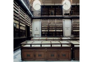
Modern Times: British Prints, 1913–1939, a major exhibition of one hundred of these works now on view at the Metropolitan Museum of Art, reveals the senses and sensibilities of Sybil Andrews, Claude Flight, Christopher Richard Wynne Nevinson, Power and Edward Wadsworth, among others — the artists who made British printmaking modern. The exhibition also pays tribute to Leslie and Johanna Garfield, the husband-and-wife collecting team who pursued these rare works over three decades and gathered them together. They lived with them among tens of thousands of other prints in their Upper East Side apartment, tucked away in special drawers and sliding walls, before transferring 700 of them to the Metropolitan in 2019. It was a significant acquisition, instantly making the Met a leading collection for British prints. This is our first chance to see it all together — including for Leslie Garfield himself, as he told me at the opening.
“You go to books on modernism — nothing. You go to books on British modernism — nothing.” That’s what Jennifer Farrell, the exhibition’s curator, suggested to me about the lack of notoriety for these works. Modern art in Britain often gets overlooked for its Continental and American cousins, and unfairly so. In form these British prints could go toe to toe with their Italian Futurist or French Cubist relatives. A generation later, British artists such as Richard Hamilton — another Garfield focus — were manufacturing Pop art before Warhol’s American factory ever cranked out its first soup can. In many cases, British artists’ turn to form over function took on “modern times” in ways that other modernisms rejected. Faced with the true shock of the new, and sometimes battling psychological demons, these artists printed form in order to function in Britain’s twentieth century.
A hundred years later, up against far different challenges, Farrell just about had to unlock the Metropolitan herself to get these acquisitions inventoried and photographed in time for this exhibition, the print department’s first since winter 2020. But I could think of worse ways to spend the pandemic. The dynamism of this work — the colors, the energy, the crowds depicted — speak to what we were all missing.
The selection begins in the early 1910s with Wyndham Lewis, Edward Wadsworth and Vorticism — the short-lived British response to Futurism, so named by Ezra Pound for the vortex “from which, and through which, and into which, ideas are constantly rushing.” “Newcastle,” a tiny print by Wadsworth from 1913 and among the earliest in the show, turns the gears of industry into rotating, gnashing, zig-zagging teeth of black and white. The deadly engine of World War One would soon make that vortex all too real. As artists were called up to camouflage ships at sea, Wadsworth’s “Liverpool Shipping” of 1918 turns an entire image into a dazzle pattern of lines that energize and confound their forms.
Such lines — centrifugal and confounding — followed British printmaking through the interwar years. Now, instead of simply black and white, we see artists use all sorts of stunning colors, printed through an increasingly complex arrangement of blocks. At the Grosvenor School of Modern Art, a London school founded by the engraver Iain Macnab in Pimlico in 1925, Claude Flight practiced, taught and popularized linocut techniques. Flight wanted the price of a print “to be equivalent to that paid by the average man for his daily beer or cinema ticket.”
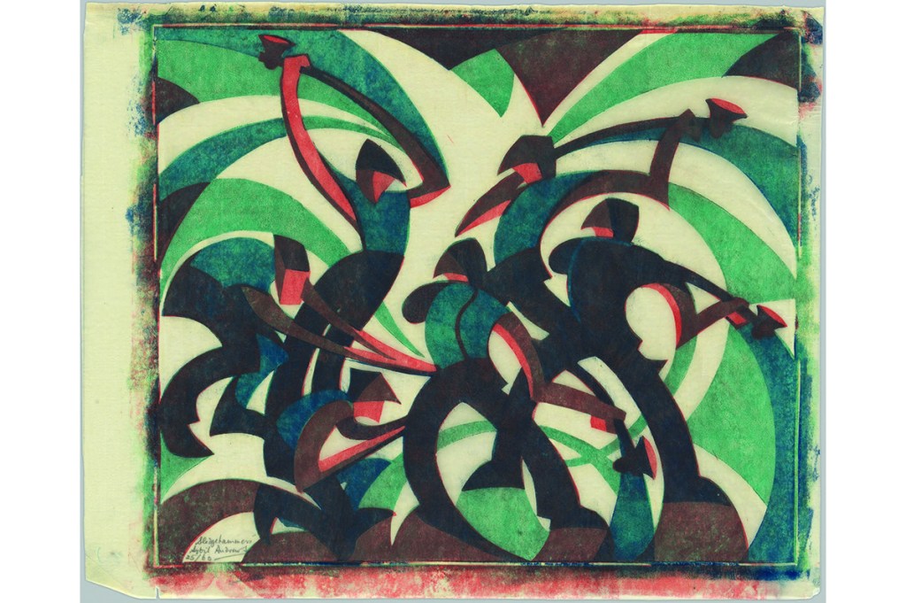
Such a democratic impulse did not make his students rich, but Sybil Andrews, Cyril Power, Lill Tschudi and other Grosvenor School artists went out to apply Vorticist swirls and jags to the circles of the Tube, the curves of the concert hall and the eddies of the crew oar. Tschudi’s “Underground” (1930) uses forms of color to trace the tunneling curves. Andrews’s “Sledgehammers” (1933) swings and dazzles in clanking colors of green, blue, orange and brown. Meanwhile, Power’s “The Merry-Go-Round” and “Whence & Whither?” (both c. 1930) turn crowds, whether on a carnival or escalator ride, into swirling masses.
Is all this activity enough for Garfield? Surveying the exhibition opening, he admitted to me that he is still collecting. “It’s terrible, I am. I bought something yesterday.” He said he was setting his alarm for six the next morning in order to be up in time for the London sales. “Come,” he says, taking me by the arm.
He brings me over to Robert Gibbings’s “Dublin Under Snow.” This small black-and-white print from 1918 falls outside the purview of Modern Times but was nevertheless included here as a last-minute addition. “Dublin Under Snow” turns the snow-covered rooftops as seen from Gibbings’s barracks into an abstraction of alternating angular forms. Gibbings was a master of printmaking’s negative spaces, with its reversals of carved and inked forms.
Farrell suggests that the work evokes the famous final lines of James Joyce’s “The Dead,” published in Dubliners just a few years before in 1914: “His soul swooned slowly as he heard the snow falling faintly through the universe and faintly falling, like the descent of their last end, upon all the living and the dead.”
While Leslie was the initial collector of prints — he purchased his first Erich Heckel woodcut in 1954 — it was Johanna who directed their interests to British printmaking and the more colorful works of the Grosvenor School. “If we had different pictures on this wall, our children would be different,” she once told Leslie. Johanna passed away in August, just as the exhibition of her collection was being finalized. While it could not appear in time in the catalog, “Dublin Under Snow” serves as a quiet tribute to her. “This,” Leslie tells me, “is Jo’s favorite.”
Modern Times: British Prints, 1913-1939 is on view at the Metropolitan Museum of Art until January 9, 2022. This article was originally published in The Spectator’s December 2021 World edition.